Sankey Diagrams
Sankey diagrams are powerful tools for visualizing flows of data, showing how values move from one set of categories to another. They are particularly useful for displaying energy flows, financial transfers, or user journeys etc.
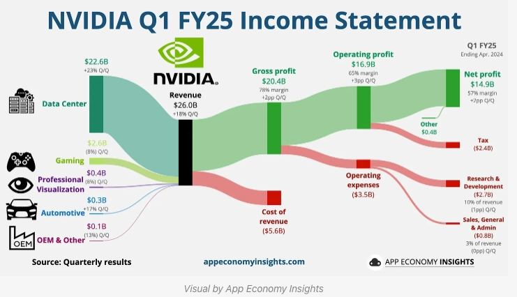
A sankey diagram consists of nodes (representing categories) and links (showing the flow between these categories). The width of each link is proportional to the flow quantity it represents, making it easy to compare different flows.
Here’s as an example of sankey diagram showing the income flow (Source: App Economy Insights)

Creating Sankey Diagrams with Mermaid.js
Mermaid.js provides a straightforward way to create Sankey diagrams using a syntax similar to CSV. Here’s how you can create one:
Basic Syntax:
Start with the sankey-beta keyword, followed by your data in a CSV format with three columns: source, target, and value.
```mermaid
sankey-beta

%% source, target, value
Portfolio, Investments, 70
Portfolio, Cash & Equivalents, 30
Investments, Equities, 50
Investments, Bonds, 20
Equities, US, 30
Equities, Others, 20
```
This will render the Sankey diagram as below:
Ending
Sankey diagrams are an excellent way to visualize complex flows and relationships between different categories. With Mermaid.js, creating these diagrams becomes a simple and customizable process. You can start with a basic CSV format and enhance your diagram with various configuration options to meet your specific needs.